테이블은 날짜 선택과 같은 타사의 캘랜더 모듈에서 많이 되어 기본적으로 스타일을 사용자가 선택하도록 설계되었습니다. 기본 클래스 .table을 <table>에 추가 한 다음 사용자 정의 스타일이나 다양한 포함 된 추가 클래스로 확장하면됩니다.
가장 기본적인 테이블 마크 업을 사용하여 테이블 기반 테이블이 부트스트랩 에서 어떻게 나타나는지 알수 있습니다.
.table-bordered 클래스를 추가하여 테이블과 셀의 모든 테두리를 변경할 수 있습니다.
#
First Name
Last Name
Username
1
Mark
Otto
@mdo
2
Mark
Otto
@TwBootstrap
3
Jacob
Thornton
@fat
4
Larry the Bird
@twitter
<tableclass="table table-bordered"><thead><tr><th>#</th><th>First Name</th><th>Last Name</th><th>Username</th></tr></thead><tbody><tr><thscope="row">1</th><td>Mark</td><td>Otto</td><td>@mdo</td></tr><tr><thscope="row">2</th><td>Mark</td><td>Otto</td><td>@TwBootstrap</td></tr><tr><thscope="row">3</th><td>Jacob</td><td>Thornton</td><td>@fat</td></tr><tr><thscope="row">4</th><tdcolspan="2">Larry the Bird</td><td>@twitter</td></tr></tbody></table>
#
First Name
Last Name
Username
1
Mark
Otto
@mdo
2
Mark
Otto
@TwBootstrap
3
Jacob
Thornton
@fat
4
Larry the Bird
@twitter
<tableclass="table table-bordered table-inverse"><thead><tr><th>#</th><th>First Name</th><th>Last Name</th><th>Username</th></tr></thead><tbody><tr><thscope="row">1</th><td>Mark</td><td>Otto</td><td>@mdo</td></tr><tr><thscope="row">2</th><td>Mark</td><td>Otto</td><td>@TwBootstrap</td></tr><tr><thscope="row">3</th><td>Jacob</td><td>Thornton</td><td>@fat</td></tr><tr><thscope="row">4</th><tdcolspan="2">Larry the Bird</td><td>@twitter</td></tr></tbody></table>
마우스에 반응하는 행
.table-hover t클래스를 추가하여 테이블행에 마우스 포인터가 올라오면 스타일을 변경하도록 지정할 수 있습니다.
#
First Name
Last Name
Username
1
Mark
Otto
@mdo
2
Jacob
Thornton
@fat
3
Larry the Bird
@twitter
<tableclass="table table-hover"><thead><tr><th>#</th><th>First Name</th><th>Last Name</th><th>Username</th></tr></thead><tbody><tr><thscope="row">1</th><td>Mark</td><td>Otto</td><td>@mdo</td></tr><tr><thscope="row">2</th><td>Jacob</td><td>Thornton</td><td>@fat</td></tr><tr><thscope="row">3</th><tdcolspan="2">Larry the Bird</td><td>@twitter</td></tr></tbody></table>
#
First Name
Last Name
Username
1
Mark
Otto
@mdo
2
Jacob
Thornton
@fat
3
Larry the Bird
@twitter
<tableclass="table table-hover table-inverse"><thead><tr><th>#</th><th>First Name</th><th>Last Name</th><th>Username</th></tr></thead><tbody><tr><thscope="row">1</th><td>Mark</td><td>Otto</td><td>@mdo</td></tr><tr><thscope="row">2</th><td>Jacob</td><td>Thornton</td><td>@fat</td></tr><tr><thscope="row">3</th><tdcolspan="2">Larry the Bird</td><td>@twitter</td></tr></tbody></table>
작은 테이블
.table-sm 클래스를 사용하여 셀크기를 반으로 줄임으로써 작은 테이블을 만들 수 있습니다.
#
First Name
Last Name
Username
1
Mark
Otto
@mdo
2
Jacob
Thornton
@fat
3
Larry the Bird
@twitter
<tableclass="table table-sm"><thead><tr><th>#</th><th>First Name</th><th>Last Name</th><th>Username</th></tr></thead><tbody><tr><thscope="row">1</th><td>Mark</td><td>Otto</td><td>@mdo</td></tr><tr><thscope="row">2</th><td>Jacob</td><td>Thornton</td><td>@fat</td></tr><tr><thscope="row">3</th><tdcolspan="2">Larry the Bird</td><td>@twitter</td></tr></tbody></table>
#
First Name
Last Name
Username
1
Mark
Otto
@mdo
2
Jacob
Thornton
@fat
3
Larry the Bird
@twitter
<tableclass="table table-sm table-inverse"><thead><tr><th>#</th><th>First Name</th><th>Last Name</th><th>Username</th></tr></thead><tbody><tr><thscope="row">1</th><td>Mark</td><td>Otto</td><td>@mdo</td></tr><tr><thscope="row">2</th><td>Jacob</td><td>Thornton</td><td>@fat</td></tr><tr><thscope="row">3</th><tdcolspan="2">Larry the Bird</td><td>@twitter</td></tr></tbody></table>
컨텍스트 클래스
컨텍스트 클래스를 사용하여 행 혹은 셀의 색상을 지정할 수 있습니다.
Type
Column heading
Column heading
Column heading
Active
Column content
Column content
Column content
Default
Column content
Column content
Column content
Primary
Column content
Column content
Column content
Secondary
Column content
Column content
Column content
Success
Column content
Column content
Column content
Danger
Column content
Column content
Column content
Warning
Column content
Column content
Column content
Info
Column content
Column content
Column content
Light
Column content
Column content
Column content
Dark
Column content
Column content
Column content
<!-- On rows --><trclass="table-active">...</tr><trclass="table-primary">...</tr><trclass="table-secondary">...</tr><trclass="table-success">...</tr><trclass="table-danger">...</tr><trclass="table-warning">...</tr><trclass="table-info">...</tr><trclass="table-light">...</tr><trclass="table-dark">...</tr><!-- On cells (`td` or `th`) --><tr><tdclass="table-active">...</td><tdclass="table-primary">...</td><tdclass="table-secondary">...</td><tdclass="table-success">...</td><tdclass="table-danger">...</td><tdclass="table-warning">...</td><tdclass="table-info">...</td><tdclass="table-light">...</td><tdclass="table-dark">...</td></tr>
.
#
Column heading
Column heading
Column heading
1
Column content
Column content
Column content
2
Column content
Column content
Column content
3
Column content
Column content
Column content
4
Column content
Column content
Column content
5
Column content
Column content
Column content
6
Column content
Column content
Column content
7
Column content
Column content
Column content
8
Column content
Column content
Column content
9
Column content
Column content
Column content
<!-- On rows --><trclass="bg-primary">...</tr><trclass="bg-success">...</tr><trclass="bg-warning">...</tr><trclass="bg-danger">...</tr><trclass="bg-info">...</tr><!-- On cells (`td` or `th`) --><tr><tdclass="bg-primary">...</td><tdclass="bg-success">...</td><tdclass="bg-warning">...</td><tdclass="bg-danger">...</td><tdclass="bg-info">...</td></tr>
반응형 테이블
.table 클래스에 .table-reponsive 클래스를 추가하여 테이블에 반응성을 추가할 수 있으며, 768px 작은 해상도에서 가로로 스크롤 되게 변경합니다. 그 이상의 크기에서는 변동이 없습니다.
수직 클립핑/절단
반응 형 테이블은 overflow-y : hidden을 사용합니다.이 오버 플로우는 테이블의 아래쪽이나 위쪽 가장자리를 넘어서는 모든 내용을 잘라냅니다. 특히 이것은 드롭 다운 메뉴 및 기타 타사 위젯을 잘라낼 수 있습니다.
Java8 Stream 가이드 1. 개요 Java 8의 새로운 기능 Stream에 대해 설명합니다. 2. Stream API Java 8의 주요 새로운 기능 중 하나는 여러가지 요소(element) 처리를 위한 매우 강력한 스트림 기능인 java.util.stream 입니다 . 클래스는 Stream 이며, T 타입 기반의 Stream을 다양한 방법으로 생성할 수 있습니다. 2.1. Stream 생성 stream () 및 of () 메소드를 사용하여 콜렉션 또는 배열과 같은 다른 요소 소스에서 스트림을 작성 String [ ] arr = new String [ ] { "a" , "b" , "c" } ; Stream < String > stream = Arrays . stream ( arr ) ; stream = Stream . of ( "a" , "b" , "c" ) ; stream 을 생성하는 쉬운 방법은 컬렉션 인터페이스를 통해 생성할 수 있습니다. Stream < String > stream = list . stream ( ) ; 2.2. 멀티쓰레딩 Streams stream API는 또한 스트림 요소에서 병렬 모드로 작업을 실행 하는 parallelStream() 메서드를 제공하여 멀티 스레딩을 단순화 합니다. 아래 코드 는 스트림의 모든 요소에 대해 doWork () 메소드 를 병렬 로 실행할 수 있도록 합니다 list . parallelStream ( ) . forEach ( element - > doWork ( element ) ) ; 3. Stream 사용법 스트림에서 제공하는 함수는 크게 중간 작업 (return Stream, self-return )과 연산작업 (특정 타입으로 return ) 으로 나뉩니다. long count = list . ...
안녕하세요. 명동섞어찌개입니다. SVG (Scalable Vector Graphics) 는 이름 그대로 Bitmap 이미지와 달리 확대, 축소해도 깨지지 않는 이미지 포맷이죠. 요새 아이콘을 화면에 넣을 때 많이 쓰는 방법으로 아이콘 폰트를 임베딩해서 쓰거나, svg 아이콘을 다운받아 쓰는 법 외에 SVG 아이콘을 그려서 화면에 적용하는 아주 간단한 팁을 알려드릴께요! 1. Adobe 일러스트레이터를 켭니다. 없으신 분은.. 디자이너분께 부탁드려보시거나 회사 라이센스 프로그램이 있을 경우 그걸 써보세요 (협업~) 2. 일러스트레이터에서 필요한 아이콘을 그립니다. 굳이 코딩으로 어렵게 계산해서 그리실 필요가 전혀 없습니다. 그냥 보면서 그립니다. 3. 아이콘을 선택한 후 복사합니다. (Ctrl + C) 4. 새 문서를 만든 뒤 붙여넣기 합니다. (Ctrl + V) [ icon-add-user-on.svg] 끝. 참 쉽죠?! 5. 마지막으로 CSS 에 적용합니다. 저 같은 경우는 일반적으로 이런 식으로 사용합니다. [layout.css] 1 2 3 . customIcon : before { content: '' ; position: absolute ; top: 12 px ; left: 3 px ; background - size: 20 px auto ; background - repeat: no - repeat ; width: 20 px ; height: 20 px ;} . addUser { background - image: url ( assets / icons / icon - add - user - on . svg );} [html] 1 < i class = "customIcon addUser" ></ i >
android의 특징중 하나인 뒤로가기 버튼이 있습니다. 뒤로가기 버튼을 통해 대부분의 앱을 종료 하기 때문에 android사용자들은 앱을 종료 하기 위해서 뒤로가기를 연속적으로 누르는 행동을 많이 합니다. 그렇기 때문에 종료의 의사가 아니고 뒤로가기를 눌렀는데 앱이 종료되는 경우가 종종 생기는데요. 이런 경우에 대비해서 국내 앱들은 뒤로가기를 두번연속으로 누른경우에만 앱을 종료 시키는 방법을 많이 사용 합니다. 해외 앱들은 굳이 이런기능들을 사용하지 않는 경우가 많은걸 보면 국가별 사용하는 방식의 차이가 있나보다란 생각도 하게 됩니다. 뒤로가기 두번연속으로 눌렀을때 종료하는 방법은 쉽게 구현 할수 있습니다. 우선 activity에서 뒤로가기 이벤트를 제어 해야 합니다. @Override public void onBackPressed() { super . onBackPressed ( ) ; } onBackPressed 함수를 오버라이드 해줍니다. private final long FINISH_INTERVAL_TIME = 2000 ; private long backPressedTime = 0 ; 우선 누르는 이벤트사이의 시간 간격을 위해 FINISH_INTERVAL_TIME을 지정해 줍니다. 설정된 시간 이내에 연속적으로 뒤로가기가 이벤트가 일어났을때만 종료 되는 것 입니다. 설정해 놓은 시간이 지나면 다시 두번 눌러야 종료되는 상태로 초기화 됩니다. backPressedTime을 통해 첫번째 뒤로가기 이벤트가 일어난 시간을 알고 있어야 합니다. @Override public void onBackPressed() { long tempTime = System . currentTimeMillis ( ) ; long intervalTime = tempTime - backPressedTime ; if ( 0 < = int...
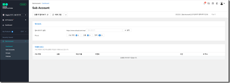
안녕하세요 남산도서관 입니다. 퍼블릭 클라우드 서비스 관리를 위한 Web Console 서비스의 메인 계정이 해킹되는 경우 운영 중인 서비스에 발생되는 문제가 함께 악의적인 인스턴스 대량 생성을 통한 요금폭탄을 마주하실 수도 있습니다. 클라우드 서비스 제공 사업자들은 이러한 피해를 최소화 하기 위하여 다양한 보안 서비스를 제공하고 있는데요 이번 포스팅에서는 그중에서도 Naver Cloud Platform 에서 적용 가능한 Sub Account 생성 기능에 대해 알아보도록 하겠습니다. 우선 Ncloud 콘솔에 메인 계정으로 로그인은 진행합니다. 1. 접속페이지 URL 설정 좌측 Product & Service 메뉴 를 선택한 후 Management > Sub Account 항목을 선택하면 Dashboard 화면이 표시됩니다. 우선 접속페이지 설정 항목 에서 서브계정 접속 URL 을 설정합니다. https://www.ncloud.com/nsa/ 뒤에 원하는 주소를 입력하면 해당 URL로 접속페이지가 설정됩니다. Sub Account Dashboard 화면 2. Sub Account 생성 좌측 메뉴에서 Dashboard 아래 Sub Account 메뉴를 선택 한 후 서브계정 생성 버튼을 선택 합니다. Sub Account 메뉴 3. Sub Account 정보 입력 Sub Account 생성 화면입니다. 로그인 아이디, 사용자 이름, 이메일 주소 및 비밀번호 입력 후 생성 버튼 을 선택하면 계정 생성이 완료 됩니다. 2차인증설정 을 필수로 선택하면 서브계정 로그인 시 이메일, SMS 를 통한 MFA 기능을 적용할 수 있습니다. Sub Account 정보입력 4. Sub Account 정책 할당 계정 생성이 완료 되었으면 이제 계정에 정책을 할당해주어야 합니다. 방금 생성된 계정을 선택하여...
안녕하세요. 남산돈가스입니다. AWS Lambda - API Gateway로 S3 파일 업로드 API 만들기 #1 , #2 에 이어 마지막 시간인 API Gateway - Lambda 연결 및 테스트가 남았습니다. 지난 포스팅까지 Lambda를 이용해 업로드 함수를 생성했고, API Gateway와 S3 기본설정을 통해 S3 파일 업로드 기능의 기본설정을 마무리했습니다. 오늘은 이 두 설정들을 연결하여 최종적으로 S3 업로드 Micro Service를 완성하겠습니다. 먼저 지난 포스팅에서 API Gateway를 생성했고, uploader라는 리소스까지 생성했습니다. 이번엔 이 uploader라는 리소스에 POST 매서드를 추가하고 작성했던 Lambda Function을 설정합니다. 통합 유형 - Lambda 함수 Lambda 리전 - 'Lambda함수를 생성한 리전' Lambda 함수 - '작성한 Lambda 함수명(리전 선택 시 자동완성으로 검색 가능)' 위와 같이 설정한 뒤 저장을 선택합니다. 저장을 선택 시 다음과 같이 uploader라는 리소스 밑에 post 매서드가 생성 된 것을 확인하실 수 있습니다. 다음으로, 우측 상단의 통합 요청을 선택하시면 아래와 같은 화면이 나옵니다. 그 중에서 하단의 본문 매핑 템플릿을 선택합니다. 요청 본문 패스스루에서 '정의된 템플릿이 없는 경우'를 체크하고 Content-Type에 매핑 템플릿 추가하여 multipart/form-data 을 추가하고 '템플릿 생성'에서 매서드 요청 패스스루를 클릭하시고 아래와 같은 패스스루가 나온 것을 확인하셨으면 저장을 누릅니다. 여기까지 설정을 완료하셨다면, API Gateway와 Lambda Function의 연결이 모두 완료 된 것입니다. 이제 실제 이 API Gateway를 배포하여 엔드포인트를 발급받고 실제 업로드가 되는지 ...


댓글
댓글 쓰기